Penny.de: Store Search & Detail Pages
REWE Digital GmbH Food Retail Responsive Web App
 by Maximilian Heere
Summary
The store search helps customers find, choose and get to know their Penny store, with a fast search and a detail page for every store. I owned it end to end: concept, UX and UI design, testing and the analysis of customer behavior.
The challenge
The old store search had launched as an MVP and was never finished: customers couldn’t open store details, couldn’t easily switch their store and couldn’t even check opening hours. That mattered, because much of what Penny offers depends on your store, above all the weekly offers.
Customers needed to find and choose their store quickly on any device, across 2,000+ stores. And without proper store detail pages, search engines had nothing to find.
Approach
We took the old store search apart and rebuilt it from the ground up. I tested every step and analyzed how customers actually searched for their store.
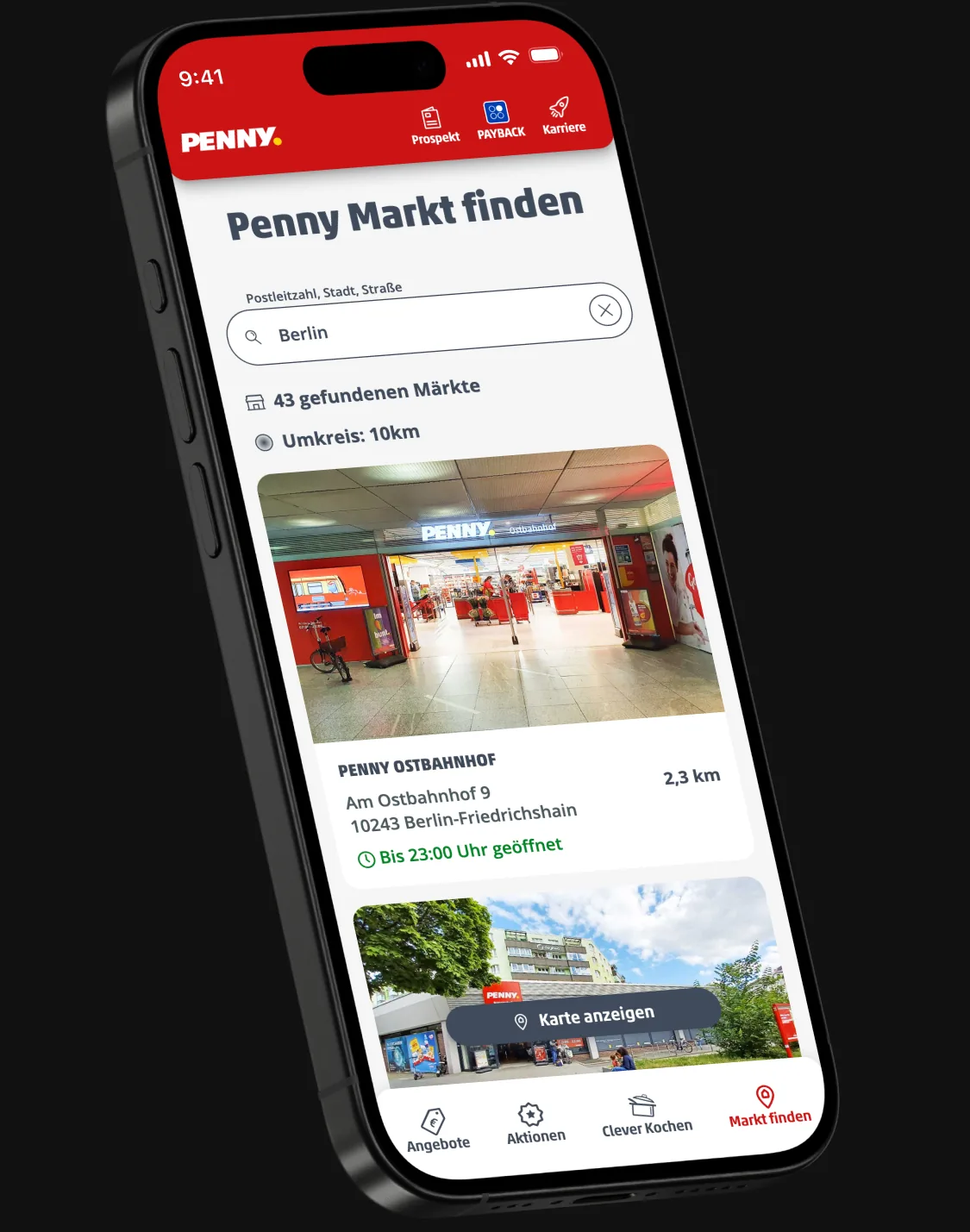
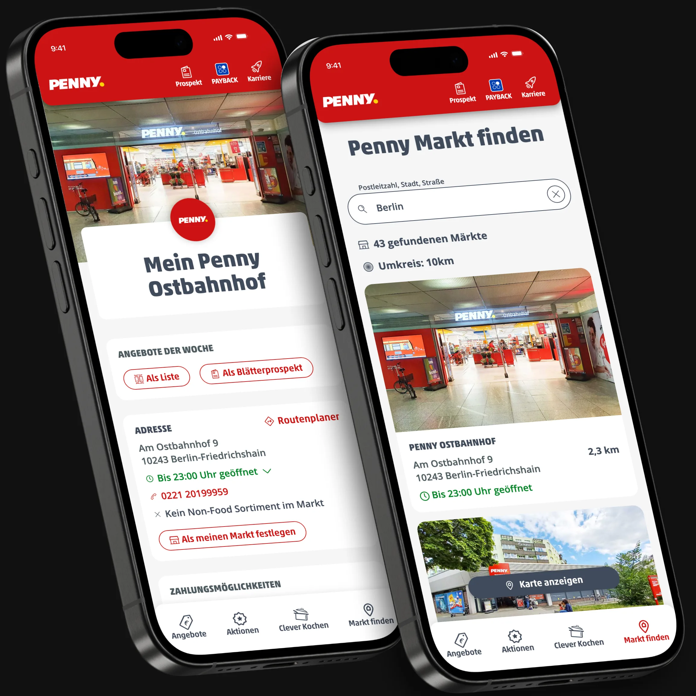
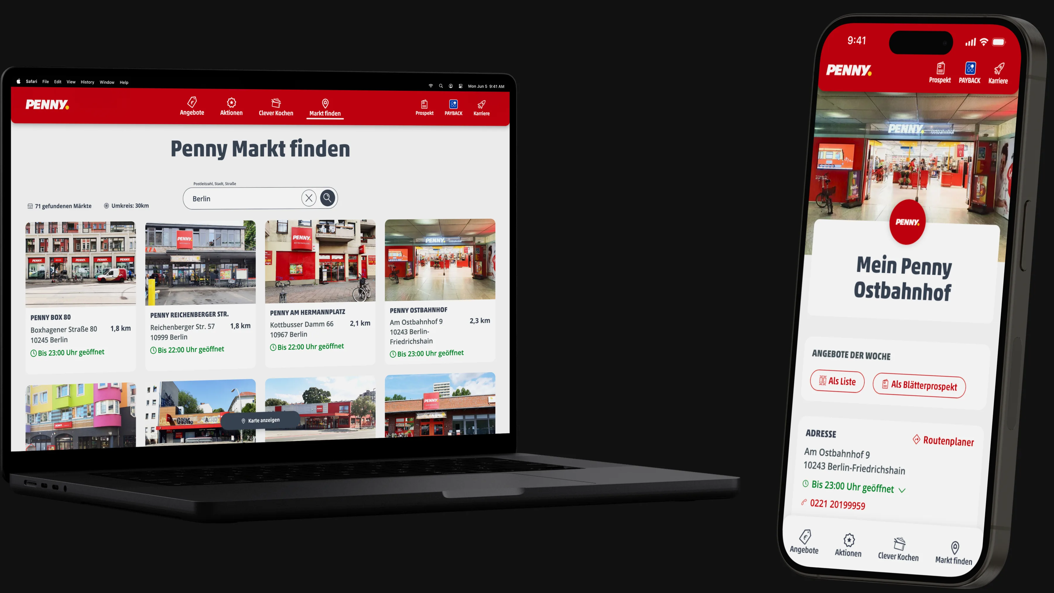
The result: one search field with location search, suggestions while typing, sticky results, a switch between list and map, and a compact store tile with live opening status. For every store, we added a store detail page with the key information and links to the most important features.
Impact
The new store detail pages became a major SEO case: 2,000+ pages that simply hadn’t existed before are now indexed and bring in significant additional traffic from search engines.
Outcome
Choosing a store went from an unfinished MVP to a complete experience, and the store search became the entry point to store-specific content like the weekly offers.
Key features
All features were fully developed and productive.
Search: Initial state
Clear focus
The search field is positioned directly in the initial viewport for clear user focus, accompanied by an activating headline. Lighthouse results in the lower viewport provide additional context.
In the initial state, users can search for stores either by typing or by pressing the location search icon for a quicker search.
Tapping the search bar moves the pre-filled helper text to the top of the field as a helper label and allows users to enter text. The focus of the search bar in typing mode is highlighted by an elevated shadow.
Typing, executing & results
Search with ease
Typing in the search bar replaces the location search functionality with a reset option, enabling quick text corrections. This change updates the component's status to make it easier for users by showing suggestions.
Executing the search removes the focus from the field and lowers its elevation. Two labels display the number of results and the search radius to keep users informed.
Browsing results
Seamless integration
As users scroll through the results, the search bar and labels float sticky at the top of the screen.
The labels have slight transparency and blur in their background to ensure readability while seamlessly integrating the informative elements into the viewport.
Map view
Choose your view
Sticky button for seamless switching between map and list view.
Location markers provide quick access to store locations. Clicking a marker opens a store tile with additional details and link to the full store information page.